Rearrange tutorial UI: remove redundant elements and move Delete button
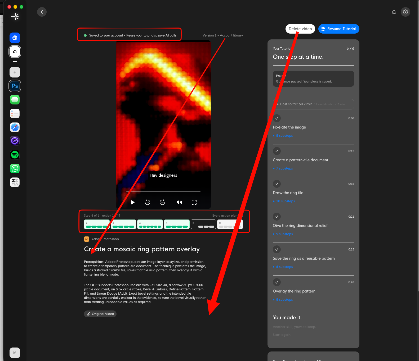
Elements boxes in red are either redundant, or sharing too much irrelevant detail, resulting in an overcomplicated UI - remove them.
“Delete video” button is too close to the Resume Tutorial button, move it to the bottom right of the description area - presumably users will not be deleting their tutorials often, so it’s ok to make it harder to find.
Tutorial version is also not necessary to have at the top, this is minor description detail most users won’t think twice about.
Log in to comment and vote
No comments yet
Be the first to share your thoughts.